Pi_Finity


Robot Design Project

Contextual Research
Ubisoft
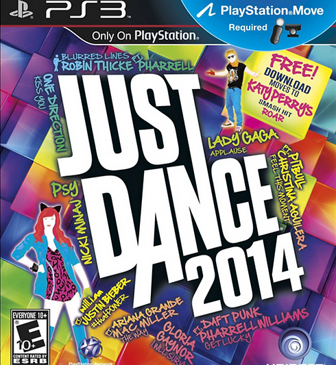
Ubisoft is a French software development business which makes and distributes video games founded in 1986 by the Guillemot Family. The Guillemots first established themselves as a support business, before creating Ubisoft which only grew into popularity by the 1990s when they released the game Rayman. Some of their well known video games include Assassin's Creed, Far Cry, Just Dance, and more.


Examples of Games


Art Styles
Ubisoft has a wide range of art styles, varied on the type/genre of game. Ubisoft mainly uses a 3D modelled and realistic art style which is what they are mostly known for, this is seen in games such as Assassin's Creed, Skull and Bones, and Far Cry. A part from the realistic art style, Ubisoft also occasionally uses 2D and other abstract art styles shown in games like Rayman and Just dance.


Ubisoft's more realistic games use lots of textures and detail to create an immersive feel, using bright, natural lighting to create more vibrant environments while also keeping the whole look of the game to seem appealing. However Ubisoft's 2D and abstract games, while being stylistic, include detail and harmonious colours in the backgrounds and characters. This makes the games visually appealing without having realistic graphics like Ubisoft's 3D games, even though the 2D games have bright saturated colours that could easily become overwhelming when applied wrong. A reason for these different styles is simply the genre of the game, with violent and more teen and adult directed games being more serious and having a realistic style to match it, and more fun light-hearted family friendly games having a cartoonish art style.
Ubisoft Game Styles: More In-depth (First look into robot designs)
Shoot many Robots
Shoot Many Robots is a 4 player side scrolling shooter game that developed by Demiurge Studios and published by Ubisoft in 2012. The game is "2.5 D" as it's style and gameplay is a combination of both 3D and 2D design and gameplay elements, for example all assets are 3D models however the player can only move in a 2D space creating the illusion of the whole game being 2D. Even though the game is more of a mix of 3D and 2D elements, I see this game as more of a semi realistic 3D game, the robots themselves are models and are in my opinion the most realistic element in the game by the way they are textured and animated, along side some of the backgrounds and environments being detailed. The key art direction that makes this game look stylised is the blocky textures that some of the models have, a lower graphics resolution, a slight outline on each model, and having most models be lower poly than more hyper realistic games giving everything a geometric look; a reason why the robots look more believable than something organic and rounder like the human models. In conclusion, this is a great art style choice for action based and platform type games, however the game I'm making a design for I assume is more realistic looking at the current hyper realistic style Ubisoft has adopted in its recent games.


Star Wars Outlaws


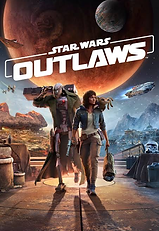
Star Wars Outlaws is an open world Star Wars game by Ubisoft that was released on August 30th, 2024.
The game features action and adventure, as well as hyper realistic graphics and impressive environments. I mainly looked at the designs of ND-5, a battle droid and an effective soldier having gone through a war and put on many frontlines, now put into deep storage. The feature I like the most in ND-5's design is the "scar" across the droid's chest reflecting his time in conflict; he also wears a long green trench coat to cover up any other damages. In the plot it is implied that he is quite a valuable and talented droid, as after he was stored he was made an enforcer droid, this is conveyed by the fact that even though some of his plating has rusted or corroded around the seams, he does not seem in a uncared or discarded condition. I will have to think about how I could convey the story of my robot designs through imperfections and weathered features as it could help them seem more believable in a SCI-FI setting.
Rainbow Six Seige: Operation Twin Shells
The last game I wanted to look out was Rainbow Six Seige and it's Operation Twin Shells; Rainbow Six Seige is apart of a team-based shooter franchise, where strategy and planning is crucial. The game itself features realistic graphics, which improve with each new release, Operation Twin Shells features a new operator called Skopós and her V10 Pantheon Shells which she uses and controls on the battle field. Focusing on the Pantheon Shells, I quite like their designs as they are realistic and detailed while also fitting into a battle and fighting focused environment. Despite being very detailed, the designs are quite recognisable, because as a silhouette they have these built and bulky figures, but have these rounded heads; they also have unique distinguishable features that I don't see in other designs like abnormal shaped feet, wire frame collars and matching blue lights on their faces and armour designs. By the way these features are implemented it shows how these two droids are built for combat. The last thing I like about these two designs is despite being almost identical, they have different features to recognise them by; the collars being different sizes, having different colours, one having antenna etc...


General
Visual Analysis
This artwork from the game Ultrakill created by Andrei Mishchenko uses bright, saturated colours and lighting to create a dramatic and vibrant piece. On the right, golden colours and blue hues contrast with the red blood dripping from the head, while the entirety of the figure contrasts with the crowds on the left, who are entirely off-white and warm colours. This visual contrast tells us of the purity of the crowd as the red blood and harsh cool tones of the figure on the left seem to warn or portray a sense of authority/ power. This is further shown by the beams of light shining on the figure, highlighting his importance within the piece. The stance and sharp, solid shape of the figure also convey his divinity and strength, the armour and wings look metallic because of the smooth strokes and straight precise edges and lines. The figure is also portrayed as angelic through the golden and white colours, the wings and halo are depicted as glowing hologram-like features.
The background being a monotone off white colour effectively still portrays a colosseum full of people, the dots and blobs in the seating area convey the shape of heads in a crowd being simplistic further to emphasise the detailed figure and background on the left. The dots in the crowd also look more organic than the colosseum, this is to define the crowd from the pillars and stairs between the seating areas which are harsh shapes depicting structure. The artist forces a sense of perspective by using lighter colours in the background and darker tones in the foreground however still instil a sense of unity by having a yellow hue over the whole piece.

I’m mostly interested in the simplistic background of the piece as despite being blobs of monotone colours, it’s effective in portraying a crowd without putting in too much detail that becomes distracting. I also like the blocky strokes of colour, using the same brush creates a defined unique style, and the way it is applied still evokes the textures it tends to (metals, clothes and structures.) However, one thing I don’t like is how the wings (specifically the wing on the right side) have exact straight edges, we can see straight edges in the background however look natural because of the way the colours blend. The wings by the way they glow and how they are slightly transparent seem to be depicted as light but have sharp edges where I expect the light to disperse. Because of the background is a dark shadowed area it highlights the right wing in a way that is distracting from the focus of the piece; being the severed head the figure is holding. I think the artist could have improved this by either putting a more noticeable glow on the wings so it blends more, adding stray beams of light, or hand drawing the edge of the wings to make it look more natural.
Visual Analysis
Robot Artwork
These analyses are focused on the robot, rather than the whole piece

This artwork by Neytirix is an adaptation of the character Glamrock Freddy, this piece is part of a series where she turns the animatronics of the FNAF franchise into hunters/ killer robots. Neytirix uses heavy and detailed linework to portray elaborate mechanisms and sharp heavy shadows to depict the extreme and stiff nature of the robot in the centre of the piece; she uses these lines effectively, not necessarily using straight and rigged lines throughout the machine’s design but in places of metal shielding and stiff components, the head being an example where this technique is not used. Using a mix of line weight and blending straight and curved lines, Neytirix creates a natural look to this robot keeping the soft friendliness of the original design while giving it an intimidating stature.
Neytirix also uses heavy and subtle lighting to further emphasise the various metalic textures of the robot, this technique is mostly seen is the head, shoulders and chest of the machine. We can see the sharp edges of the shoulder plates and neck area compared to the round shape of the head and chest plate; this is because the light on the sharper areas uses cell shading where the light hitting those areas is drawn as precise shapes, whereas the smoother surfaces have a gradient. This makes the robot seem more natural with various components and metallic surfaces rather than the robot being entirely sharp and geometric. Another way Neytirix uses lighting is by implementing bounce lights, this helps create a more natural atmosphere by helping the harsh source light seem more realistic. Neytirix implements this subtle lighting by using a soft gradient coming from the floor, the boy and the mechanical arm he’s holding representing the harsh light being deflected, then drawing small almost unnoticeable highlight details on the undersides of the robot and the nearby robot arms splayed out on the floor.
The element I like most about the piece is the contrast of vibrant and desaturated colours, especially the bright red compared to the more monotone background. In my opinion, the red is the most important part of the piece as it draws the eye to the robot as it’s the lightest part of the artwork. I also think it's impressive that Neytirix incorporated so many colours without making it seem overwhelming, this is partially because the main focus only uses the colours red and blue in the centre of the piece, while all the other colours (the colours of the arms) are scattered in the background. As well as the colour placement, Neytirix also desaturates the colours of the arms shrouded in shadow to help ease the eyes.
I think overall the detail and colour aspects of Neytirix’s piece are what interests me the most, for my artwork in character design I think I would draw inspiration from her line work and line weight variation, while in more rendered concept art I would draw inspiration from her talent in balancing colours.

Shoot Many Robots concept art by Jae Tsai portrays the design of a smaller robot controlling a bigger mechanism. Tsai uses intricate brush techniques and patterned brushes to portray metallic-rusted textures, this is seen mainly on the claws and legs of the machine. Using pencil hatching and texture brushes creates a more realistic design by conveying how much it’s been weathered and rusted, the scratches telling us the violence it inflected or withstood.
Tsai also uses colour to indicate perspective and parts of the robot fading into the foreground. On the right side of the piece, the robot’s colour changes into a lighter off-white blue-ish tone, mimicking real life and how as objects get further from our vision the colour fades into white or a desaturated light blue. I think the artist did this to accentuate the details closest to us by making us focus on the saturated colours as well as the bright red that contrasts with the lighter parts of the robot. I also think the artist made the left side more lighter to go along with the lack of details, which I think is also stylistic choice to portray more elements fading in the background.
The last element of the art I would like to talk about is the line work, in this concept art the linework seems rough and uneven, which I think perfectly compliments and portrays the rusted and war driven purpose of this robot. I also think it’s interesting how, even the line work isn’t perfect, the metal still looks sharp and metallic but still worn; I think the thickness and transparency of the strokes help make the metal still have a metallic texture even if it’s wobbly and imperfect. To add to the transparency point, I think having the line art be rendered into being details like grooves and bolts help make the robot look more realistic.
The elements I would mostly draw from this piece is the linework and colours used for perspective, it’s the part of the drawing that appeals to me the most as it keeps the art detail without having the whole drawing be distracting, focuses the eye on the most important details like the head and arm. I also like how the lack of details on the right arm aren’t noticeable until you focus on it, even though it’s not realistic it reminds me of how we only really see the details of things we directly stare at and everything we see on the sides of our the vision are blurry.

This Ultrakill poster made by Andrei Mishchenko uses contrasting colours and intricate cell shading to create an interesting piece despite being simplistic. Andrei uses colour contrast and vibrant tones to draw the eye to the robot; the background is a red tint creating a harmonious and appealing background while framing the blue machine. On the right, a blueish glow emits and hits the edges of the machine, this further emphasises the robot from the surroundings, however, blending the robot to feel belonging in the piece with the blue glow affecting the environment. The background can also represent the blue robot’s violence, causing an explosion offscreen. Apart from the red and blue, yellow is also a colour used to highlight action, light or power in the piece; for example, the glowing wings and the gun being triggered. I think the yellow is important to distract the eyes from the red that envelopes the piece as yellow is the lightest colour, as well as acts to balance the red and the blue, I also think it’s interesting the piece uses a primary colour scheme, this creates an appealing colour palette that is still striking in contrast.
Another element that infers interest is the simplistic and stylistic cell shading and how it still portrays the machine's smooth and mechanical features and textures. The most detail in the piece is centred around the robot, however, at most Andrei used blocks of separate colours neatly forming gradients or used blended gradients very subtly as shading or highlights. By using this unique cell shading it creates sharp metallic textures as well as the rigid pose of the robot, by having cells of colour it also emphasises any smaller details like the holes on the legs to the crevices on the stomach chest and head area. I think this style is a great choice as Andrei made this piece as a poster, by having clear and solid cell shading the robot from afar is recognisable, however still maintains interest with the more detailed features when looked at up close or digitally. The simple colouring or rendering also helps the background to remain simple to not distract the eye, with the room itself having basic geometry and lines with the skulls on the top and heads at the bottom being simplistic blobs of colour on closer inspection.
The last element of the piece that impacts the robot's features is the difference between the shape and brush strokes of the robot and the rest of the piece. The robot is portrayed with perfect shapes and cell shading, having straight lines and angular sides and corners, however, the explosion and organic beings below the robot have rounded shapes as well as more blended brush strokes compared to the robot. By having the machine have clean cell shading and shapes compared to the background, it portrays the robot as unnatural to its environment within the piece.
Something I would change about this piece is the figure or silhouette of the guns meant to be contained in each light beam of the wing. They are not very noticeable and I would still add a tiny bit of detail to convey the shape of a gun more intricately.
I think the style of cell shading and colour scheme is what interests me the most, it’s simplistic but still conveys the figure as a machine or robot, it makes the robot look clean without taking away from it’s design. The red, yellow and blue colour scheme is also something that fascinates me as it’s contrasting however still appealing without being overwlehming, and I would like to incorporate these contrasting colours in my art. Lastly, despite being mechanical, I would like to include Andrei's dynamic and natural pose when drawing the robot.

Robot Artwork - Experimentation

.jpg)
I have made two mood boards to help me design and experiment with creating robot designs, the first is composed of robot characters that I may use for inspiration for unique character design elements, the second mood board contains mechanical and electrical components that I could use to make my robot designs more interesting and realistic, as well as help me plan out the different robot's designs movement. With the designs I have created, I've also created themes surrounding them to help base my designs and create consistency; religious and hospital being the themes I like most. I also decided to rely on these mood boards first and with the two designs I liked most I would implement my knowledge of Ubisoft's robot designs when I developed them.

First Robot Design attempts
These are my first attempts of making robot designs, these designs were made without the help of my mood boards; with each randomly drawing inspiration to characters or ideas that formed in my head.
1. The first design was inspired by combining the head and body of the characters V1 from Ultrakill and the Sentinels from Murder Drones. This robots use would be capturing footage in wild environments and to collect materials and data. It would fuel itself by feeding on wood or animals.
2. Any particular characters did not inspire the second design at the time, however, the robot design does resemble characters like Scag from Regretevator and p.AI.nter from Pressure. The robot would be used in hospital as an active heart monitor as well as an assistant for patients.
3. This design is particularly inspired by the character Rambley from Indigo Park, being an AI cartoon creature on a monitor or screen. Instead I made a cat be the character, other than that this is the last thought out.
4. This robot is designed as a puppet for a bigger robot behind the curtain, no characters inspired this puppet, however I did draw from theatre masks. The role this robot would take would be the announcer or narrator of a play. The wire body dose resembles the limbs the drones have in Murder drones.

1.
2.
4.
5.
6.
3.
5. This deign was inspired by a sketch I did years ago; a human spider hybrid having legs formed from its ribcage instead of having mutated extra limbs. Instead, this robot is a mass of wires controlling a dead corpse as bait, the wires having mechanically extruded the ribcage to act as a framework to cling to, making easier for grip on the ceiling.
6. This design is based off the character Hatsune Miku, however, instead of looking more humanoid I've made her features more geometric and space like; solid hair, cubic face shape floating rings representing her skirt and hair decorations etc...
Religion Inspired Robots
These designs are mainly based on the second mood board based on electrical components.
1. This design is based off of humanised angels, mainly consisting of branching wires and metal frames. The angel is also faceless, but uses the giant eye in it's chest to see.
2. Based off of a biblically accurate angel, I made a design paralleling the humanised angel. The "eye" in it's centre is based off of a camera while wires hang from it similar to the first design. Two SCARTS (a type of audio-visual connector) represents the angels wings.
3. I gave this design the name "Hand of God"; the machine comes from a high place like a ceiling with light emitters coming from it's base. The hand is connected to snaking wires protected by metal plates. The Hand can also talk due to the speaker above it's wrist; I'd imagine it would do a puppet hand gesture when it talked.
4. Again I used biblically accurate angels to inspire this design, I used a specific type of angel called Throne. In the middle, a battery powers the rings which have LEDs that represent eyes. This design makes the least sense as the battery is floating in the middle.

1.
2.
3.
4.
5.
6.
7.
5. This design is based off of one particular image (shown below) of a ring of security cameras. I thought the machine would be
interesting to make into a halo; I made the design of a traditional angel with wires covering it's face and arms. It would see in 360 as of the multitude of cameras, because of this I imagine it would be a judgement angel.
6. This design was also based off of one image of a chaotic wire
post. The shape reminded me of a cross while the wires itself looked unsettling as if they were veins of a creature. I made the electrical boxes have eyes inside, other than that I made the rest of it the same. I think this creature would be a fallen angel, maybe the fallen version if the first or second design; being detained to a pole.
7. The final design is based on my own knowledge of electrical components and tools. The angels head is made up of a light bulb while it's wings are soldering irons the pattern at the bottom of it's metallic plated dress are symbols representing a electrical circuit. The chest is a plug in an electrical adapter.


Hospital Inspired Robots
These hospital robot designs are based on design 2 Bonitor from my first design attempts, as the box screen head was interesting and I wanted to expand the idea of robot heart monitors.
1. The first design was based on blue computers cables seen in the bottom right of the second mood-board as
well as images similar to it seen on the
right. The use for this robot would have
been to help those who had breathing
issues, but now due to its decrepit state
its now decomissioned and no long in
use. Now it roams where ever the hospital
discarded it.
2. This robot would act as both a heart monitor and help with blood circulatory issues, the main inspiration was a character I made in a dress up game, they had a similar design however in this adaptation I made the robot have a metallic cylindrical dress holding blood bags. I also added an IV drip stand on the back of the machine, for the circulation of other liquids other than blood.


1.
2.
3.
4.
5.
3. I wanted a more simple and friendly looking robot as a hospital would have younger patients. This robots role would be to serve bed-ridden patients while also being a request reciever for food, drink and different things. I drew the robot as a cat, however I would think there would be a function for interchangable tails and ears for different animal variants, and for those who would prefer, for there to be no ears and normal cup holder. The last function would be the extendable stand for beds of different heights.
4. This design is of a bug robot, which functions as a light during emergencies and blackouts. I'd imagine every bed would have a bug light located on the wall, the bugs have light detectors that sense darkness, as hospitals always have the lights on the bugs will automatically fly towards the designated patient when the lights turn off to accompany them. Extra bug lights would stay on the wall but still turn their lights on during emergencies.
4. This design is of a supply robot, having multiple storage units a backup generator and blood capsules with a tools apartment. The head of the robot has a light, as it's lower to the ground, people with eyesight problems might not see it; therefore it shines dim lights as a sign of it approaching. The legs are closer to it's body to avoid tripping hazards, the wires are also short or tied up to avoid the same problem.
Space Inspired Robots
The final theme I decided on was space themed robots, the designs are based off both mood-boards as well as random ideas and machines.
1. This first design is inspired by the character N from Murder Drones, adding a space and rabbit theme to the design; for instance the whiskers, ears and tail are and added feature along with the star and patterns on the legs and arms and the moon patterns on the ears. The only feature taken directly (that hasn't been changed) is the head visor. I think the use of this robot would be to collect materials from different moons as rabbits are associated with the moon in Asian folklore and represent the Aztec God of the moon.
2. Inspired off the character Wheatley from the Portals franchise, this machine is an astronaut helmet turned into a robot having two pairs of legs and a built in eye and light. I'd magic this robot would be used to collect data from planets of rocky or difficult to explore environments, being able to traverse terrain easier because of its small body and insect like legs.
3. Unlike the other designs, this robot is more like a space ship with an AI controlling it, it isn't particularly based on any characters, however the entire ship is based on a mechanical cog. Some added features are the legs which help land the ship and maintain the ship itself, as well as the inner beams creating hyper energy to release for light speed travel. There are also windows on the inside of the cog for the crew to keep watch of the energy, as well as to spot and threats that come their way.

1.
2.
3.
4.
5.

6.
7.
4. I wanted to make a more friendly and cartoonish looking robot, so I drew inspiration from the characters Prototype and Scag from Regretevator (seen on the first mood-board) as inspiration to make a slight insect themed robot astronaut design. I made the design simplistic as well as added stylistic proportions to make it seem like it would belong in a child friendly game/ TV show. I added antenna as well exposed looping wires, representing the robots more bug like features. I also added a star to the design to make it more space themed.
5. Inspired off of the Mars space rover, this machine is designed to traverse large areas in a short time, unlike the 2nd design this rover is designed to go over flat open terrain. It has a camera head, large industrial tank like wheels, a fuelling system and a large body. There is a giant shovel on the front of the machine which picks up material when lowered.
6. This robot is inspired off of the robot lamp on the second mood-board as well as draws inspiration from V1 from Ultrakill. I drew this design with the idea of it being a messenger, hence the postman themes. I gave the design shape shapes as a way to convey the machines purpose for speed and agility, however I also used softer and circular shapes to convey the more friendly appeal to the design.
7. Wanting to make a more intimidating robot design, I again used inspiration of SCARTS and also used skull imagery to create a commander type robot. This robot would oversee an army and give orders to them in battle. I thought that elevating the head of the machine with two cables on each side of the head would make a more interesting silhouette to the character rather that giving it one neck. I also drew the machine out of sharp and rectangular shapes to express the violent but calculated actions of the machine.
I also added loose wiring to portray it as more mechanical.
Developed Design 1

I decided to develop one of my first designs, Bonitor, the heart monitor, as I thought his design was cute and simple but still interesting. Despite liking the adapted version of Bonitor (the first and second designs from the hospital section), I felt like those two were too complicated and wouldn't work in an actual hospital setting, whereas Bonitor is more versatile, clearer to see that he's a heart monitor, and easy to recognise as a design.
I mainly focused on his colour palette so I decided on a cool toned colour palette to match most hospitals' cold white halls and rooms. To make his face and monitor stand out more I made the green the most vibrant colour of his design, I decided on green as it is a colour of vitality and growth as well as being used as the LED colour of normal heart monitors. I changed the hue with colours like red to lean towards cooler tones to make the red more unified with the rest of the design.
I then added some shading and light texturing just to roughly outline what each part of the machine is made out of, before colouring the line work to look more define. I lastly added some light damaging details like darker spots and smudges on the machine just to add some extra dimension.
I didn't change much from his original design, rather I made it more simple by taking away most of the arms and some of the loose wires to make him look more clean. I also simplified it's face as well as the bolts on the wheel cover. This is because, in my opinion, his old face and the amount of arms made him a little too intimidating when the purpose of this robot was to be friendly.
Developed Design 2
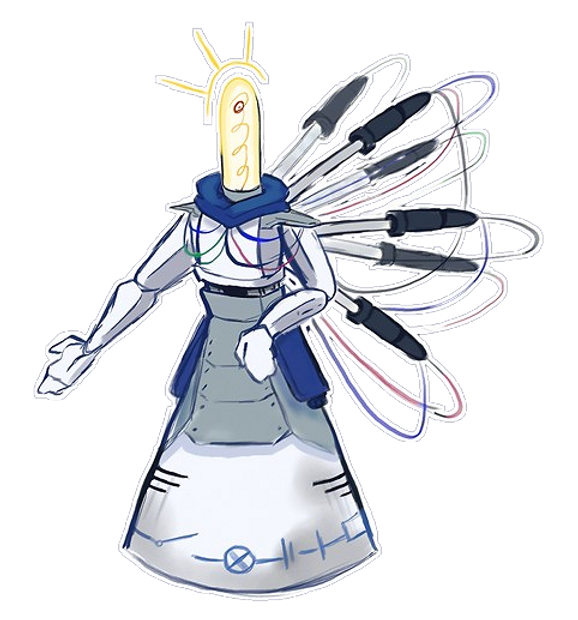
For my second developed design, I chose the seventh design in the Religious themed section, this is as I thought this design would fit well in a SCI-FI setting. I also liked the unique aspects of this design which I haven't seen anywhere else game wise.
I changed many things about this design, adding a lot more elements that would hint to this robot being in a SCI-FI setting; taking inspiration from ND-5 I added one accessory as well as metal plating to this design. Using more inspiration I used Mariyamn from Qualia Automata for the different coloured wires as in the original the wires were disconnected trailing off into nowhere. I also added to the dress section, making the symbols more clear, adding ventilation grids and adding the metal plating on top with the extra blue plating on the sides to match the blue scarf.
With this design I made sure to use mainly round or square shapes, as circles are often associated with harmlessness and approachability, while squares are often reliable and strong. I wanted to use this shape language to convey how this robot is like an angel figure of some kind, either being a guardian or protector of people. This is why I added the light nod to metallic armour; adding only parts as the robot is is not meant to fight normally but to act as a shield, however I did add soldering irons to it's back which don't have a function, maybe as a last effort it does fight back by using the last of its power to burn enemies with the irons.
Overall it's design is appealing however I would struggle to see it in a Ubisoft SCI-FI setting as most of those robots are mainly humanoid or very geometric, rarely being a mix which this design seems to be.

Final Developed Design
Bonitor
I decided to go with my first developed design as when comparing both, Bonitor was the design that was easier to distinguish, and could fit into a SCI-FI world. Where the lightbulb angel, despite having a much more interesting and detailed design, I couldn't see being practical or fitting into a setting like the environments for Star Wars: Outlaws, Starlink: Battle for Atlas, Shoot many robots or any SCI-FI/ robot focused games Ubisoft has released.
With the texture I made everything have a sheen or smooth to replicate either metal, plastic or rubber. The stand is made out of this smooth shiny metallic material; the stand is the most smooth having the most highlights and the blue base and main body being made out of less reflective plastic material. The hands are also metallic, however have less shine due to having a rougher surface, and the wired arms and wheel are the least reflective to convey a rubbery material. Apart from conveying the texture, I also wanted it to look more friendly, therefore I used soft brushstrokes for most of the shading and avoiding the use of high contrast colours with the exception of the monitor LEDs.
Despite this design being a good concept that I feel fits a hospital theme, when Ubisoft makes a SCI FI game including robots, the designs for those games are more run-down, rusted and damaged. Therefore something that could improve this design based on other Ubisoft games is telling this robots story by adding rust, scratches and damages to it's design. Looking into realistic style games by Ubisoft, I see this developed design mainly fitting into the style of games like Grow up and Starlink: Battle For Atlas which are more simplistic or stylised; where the colour usage is to fit a more appealing vibrant aesthetic and the designs are more playful and expressive.

Modelling Summary


I started off with simple shapes like cylinders, spheres, boxes and lines. I used the boxes mainly for the main body and blue base, using cylinders and spheres for the stand, wheel and buttons. The lines are representative of the long rubber pipes for the arms. The wheel cover is a pyramid slightly modified to have a more cylindrical shape. I made these shapes simple so I could build more details off them later, as I wanted to figure out the proportions and structure now as later on it would be harder to do so.
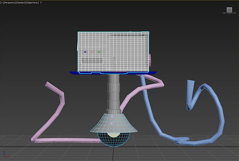

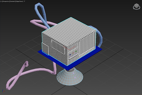

I then modified all the different objects with edit poly or other modifiers; for the main body I mainly added key features like embedding the two screens and creating the panel underneath the buttons, I also added other features that weren't included in the concept like other panels, a ventilation grille, a hole at the back for the rubber tubes and random metal panelling. This was to make the robot seem more realistically worn (having been fixed up and tinkered with) to better fit the theme of Ubisoft robot designs. The blue base and stand were modified to look more like the concept art, making the stand seem extendable, as well as the lines being thickened for a more tube like appearance. I also changed the wheel cover to be less pyramid shape adding a smooth slope, this was to help have more shape variety rather than the whole robot have straight surfaces, I then smoothened out the red button on the side of the machine to be accurate to the concept art as well as to make the button add some surface variation like the wheel cover. Lastly I added a middle component to the wheel so it wouldn't be bland.


The hands were the most complicated aspect as I didn't need to just model hands but I needed to make them robot like (referencing the concept art) as well as pose them. I used a plane as a base for my hand separating the edges with an Edit Poly to make my individual fingers and changing the heights of each digit accordingly, this would help me pose my hand as later when I would finish modelling I could just move the base to pose the fingers. I then added a Shell modifier to make it 3D, adding another Edit Poly mod to shape the hand itself and create a thumb. To smoothen the model I used an OpenSubdiv and then an Edit Poly to make the different metal components and plates that covered the hand.
This was the most tedious part as I had to extrude and shape each ring of plating on each finger as well as divide the hand into each muscle that would move on a normal hand. Afterwards I made the hand's wrist that would connect to the rubber pipe. Using another OpenSubdiv I smoothened the model again, using one last Edit Poly to accentuate the grooves and details in the hand. I duplicated the default hand twice, the two new hands being used to pose and the original being there for backup, I placed the two new hands on the end of each rubber tube. Hiding all the modifiers leaving just the first Edit Poly I posed the hand, after I was happy with the position of each finger I switched on all the modifiers, tweaked the last Edit poly for fixes and was done with the model, I Unwrap UV- ed all the objects just in case, then saved my work. I'm pretty happy with my first attempt of making hands but I would definitely rig them next time to stop the hassle of editing the model itself.

Texturing Summary


The texturing stage is where I strayed from the original concept art the most, as I said I wanted to make the robot seem more in line to other Ubisoft robot designs, which is more aligned to battered, rusting and damaged robots like the V10 Pantheon Shells from Rainbow Six Seige, ND-5 from Star Wars Outlaws and the many violent robot enemies from Shoot Many Robots. I therefore started out with normal metallic textures, also planning out the face and where some damage and corrosion would appear, I then did some experimenting with rust and specs, using a speckled brush with a rust material to scatter some dirt onto the main body, and using Smart masks added dirt and rust around the base of the body and under the buttons, metal panels and ventilation. I also used Smart Masks to create the effect of a worn and used button on the side of the machine, afterwards going in lightly all over the main body with a scratch and a speckle brush to add more subtle details.
I did the same with the other metallic parts like the stand, the wheel cover and hands. For tinier details I added screws on the corners of the metal panels to make them appear bolted, making the layer under the rust so the bolts also look affected by time, and used a leak brush create drip stains from the ventilation system and open panels. I made the hands slightly more rusty and worn in the palm and inner fingers as a way to convey it grabbing and holding things and therefore damaging the surface of the hands. After applying the rust, I went and made the material of the screens more reflective and made a Emissive channel to make the eyes, mouth and monitor glow in the environment before adding damage to the screens as well. Lastly for the rubber parts, I used a rubber smart material and used the fill brush to create the textures for the rubber pipes and wheel; I added dirt on the bottom of the wheel and to the underside of the rubber tube to create the illusion of the tubes being dragged on the floor and the robot having travelled through dirt.

Evaluation
Research
My brief was to make a robot design for an upcoming SCI FI game from Ubisoft. To start my research, I looked at the two main styles Ubisoft uses for their games; realistic and stylised, this helped me decide the art style I wanted my robot to be in which was leaning towards a more naturalistic style. Next, I researched different games Ubisoft had published that contained realistic or at least semi-authentic robot designs, for example, I studied; Shoot Many Robots, Star Wars Outlaws and Rainbow Six Seige. Studying these games helped me grasp what I wanted my designs to look like, apart from the more realistic games I also did some light research into games like Grow Up in case I wanted to do a more stylistic approach.
I also looked into Ubisoft games in the SCI-FI genre like Watch Dogs, Starlink: Battle For Atlas, Far Cry 3: Blood Dragon etc... Many of the games had different styles but all leaned more towards more realistic graphics and combat or explorative gameplay style. Therefore I assumed the environment for this game would be rough and open, as it was SCI-FI maybe taking place on a different planet or an altered version of Earth, all these factors would affect my design.
The visual analysis of the robot-related artworks helped me understand what defined a good robot design, with some key features being geometric shapes, lots of mechanical components that would make sense for the environment and purpose of the robot, an interesting colour palette which normally consists of one overarching colour with the highlight of one other colour (normally stemming from a light source somewhere on the robot,) and so on. These are the main features I saw which I would see in many other designs when conjuring up my moodboards.
Design
Deciding I would have more freedom with my designs if I were to focus on the different features rather than the research I gathered, I decided to create my 20+ designs first before adding key Ubisoft SCI-FI elements. However what I did use from Ubisoft designs and my visual analysis is shape language; using more sharp objects and triangles for robots that had more violent tendencies or had to be streamlined for speed, squares for robots who were reliable and strong and circles and round edges for more friendly machines. Creating themes helped me explore different possible ideas I could use, with designs from the Hospital and Religion theme, in my opinion, fitting into more of Ubisoft's realistic games and the Space and First Attempts being more of a mixture of realistic and stylistic.
With the developed designs I decided to include some more Ubisoft design elements like dirt and rust. However, I thought the environments and purpose given to these designs (a hospital or the equivalent of heaven in a SCI-FI game) would leave them in a better condition rather than the rough and damaged battle-focused robots Ubisoft usually produce; I, therefore, gave them each an appropriate amount of damage and stains. As well as adding some Ubisoft elements I mainly added features I gained from my visual analysis to make the concept art look more appealing as well as add to the character design; for example I added the depth perception colouring from my analysis of Gorilla onto my second developed design and also added my knowledge of contrasting colours from my Ultrakill analysis, but applied it in an opposite affect to create a cooler and harmonious colour palette.
I ended up picking Bonitor, this is because out of the two designs I felt like it would be more fitting for a SCI-FI game, I cleaned up his developed design for a better reference. When I was done modelling it, I realised that his concept art would not fit in the roster of the other robots Ubisoft would make. I then decided during texturing to change the planned environment I gave him to be abandoned, so when I added the extra damage it would make sense for all the rust, stains, scratches etc...
Opinions
I think the amount of research I did was helpful, as it helped me easily start with coming up with ideas for my robots. Looking at a range of Ubisoft games, specifically the designs and different SCI-FI settings within those games, really helped with the type of robots I wanted to create; either humanoid or very abstract in style. I also learned how most of the battle and combat robots are more realistic, however I do think I could have implemented this better with designs like the space themed robots. Overall I think I did enough research to help me on my design work.
I also thought the research I did with the visual analysis helped me create more eye catching and appealing artwork for my developed designs and my final developed design.
With the first developed design, I think the it does fit the SCI-FI criteria for a futuristic abandoned hospital but would feature in a game with less realistic graphics due to its cartoonish proportions compared to the realistic textures it adorns.
One feature I quite like is its face, it shows that it's not malicious with the reasoning for it being so damaged that it was presumably abandoned. I also quite like the hands, they are the most detailed and one of the key features of its design along with the monitors. Despite my opinions of it belonging more in a game with less realistic graphics, I do think I did well with the rust and metallic textures, it builds on visual storytelling (that it was maybe mistreated and then ditched from all the stains and scratch marks) with all the damage that it has.
Its design is appealing and recognisable but I do see some elements of the design I could improve like the overall shape of the robot being sharp when it is supposed to be friendly (which smoothing the edges could help), as well as the design not being realistic gravity and mechanically wise (one of the reasons why it would fit in a less realistic game.) Adding onto things I could improve, an overall opinion people have is to change the rubber texture, as with the dirt and rust textures on top it looks like more metal.