Pi_Finity
Animation Project
Brief
I have been asked to make an animation showcasing potential robot designs for a SCI-FI game, and that the robots could be based on the designs Metal gear, Portal, Horizon ZD, Primordia, and Fallout. I need to research some artists to inspire my designs, make concept art and a design, model and texture the robot and lastly animate it. The robot and the robots inspiring the robot design should be relatively simple to animate and the animation is recommended to be under 30 seconds. I must manage my time wisely to get the animation fully finished.
Artist Research
According to the brief, I am asked to make a game with robot designs similar to those of Metal Gear, Portal, Horizon ZD, Primordia, and Fallout. Looking at designs from these games briefly, most have a semi-realistic or realistic style with detailed intricate components, except Primordia; the whole game is pixilated. Each game has unique design motifs for its robots, for example, Horizons ZD's robots are more animalistic while Portal's robot designs are more SCI-FI, geometric and distinct. One key factor that tied most of these robot together was the amount of detail and thought that went into each design to make them look realistically functional and mechanical while also making them unique. I'm aiming to find a SCI-FI artist that can create robot designs that can make compelling robot designs that are semi-realistic and sensible.
Andrei Mischenko


I've analysed and mentioned Andrei Mischenko's works in previous projects but have never fully analysed their designs or the process of making them. When making concepts Andrei tends to make multiple iterations within multiple stages before settling on a final design, these iterations are a variety of colour experimentation to experimenting with the core of the designs. I think this is an important process as it expands the options the artist could pick when trying to make a consistent and interesting design. It also opens up options for any commissioners, as this process helps the client pick the most optimal and appealing features for their designs.
To explain the design process further, Andrei normally starts out with multiple sketches of rough shapes and silhouettes which they draw over and flesh out, they then pick which designs they like most and make one to two iterations of those designs. They again pick what design they like most and add multiple colour iterations to it, sometimes adding lighting to see what the character would look like with different environments, before picking the most optimal one and making a full reference sheet.
Analysing the art itself, the feature that expresses Andrei's designs as robots the most would be how careful and precise the line work is. Each brush stroke is made with a flat brush, with the lines themselves having carefully placed line weight to make the designs look more angular and geometric. The precision is an important key factor as even without line weight (for example the purple robot design sheet and iterations) the lines are straight and consistent so even without the depth that line weight can express the designs still look mechanical. Another factor that contributes to the effectiveness of Andrei's designs is the simple shading techniques they use when colouring in their reference sheets. Andrei uses a combination of gradients and blended shading to create the texture of smooth metal surfaces in their simple references while also including some cell shading in their fully rendered concept. The last thing I noticed with their designs is the balance in detail, with different areas having complicated components like mechanical joints, air vents and folding plates while other areas have smooth metallic shells/ plating which have sparse details and features. It's important for designs to have these negative or blank spaces so the character doesn't look overwhelmed with detail.
Ilya Pantyuhov
After analysing Andrei Mischenko's art, I wanted to find another similar artist as Andrei hand only a handful of robot art, most of them being fully rendered drawings where as I wanted to find more design processes so I could hopefully replicate the same procedure for my sketches.
Ilya Pantyuhov is a similar artist to Andrei Mischenko, making robot designs with multiple iterations and having a semi-realistic art style, however being more realistic stylisation wise compared to Andrei. I picked this artist as they utilise a lot more shape language and create interesting silhouettes with their design iterations. Like Andrei, they create iterations, however they also create these iterations by colour blocking greyscale; I think this gives their art more form and dimension as the cell shading helps convey the details in the rough designs despite how simplistic the drawings are. I think creating a distinct silhouette is important to convey the characters use or personality, for example having all these sharp edges and bulky areas gives me the impression that these robots were built for fighting or construction.
I also would like to point out how Ilya highlights their concepts, and how simplistic but effective adding a contrasting tone or colour can be when making a design stand out. Ilya in many of their concepts add a source of glowing light in almost all their designs, this adds points of interest when trying to make a design. This is one of the elements seen in both of the artists I've looked at and I would like to add the same feature in my designs.
Ilya's blocky shading is much more noticeable, however still managing a metallic texture because of how the shading is still blended smoothly and how there is the additive shine to the edges of the different components. These harsher lighting affects compared to Andrei's work help make the robots look more smooth, not that Andrei's less reflective technique is a negative; I think the different reflective techniques rather convey the different textures of different metals. I think it's interesting how adding a small amount of shine to a surface can change a surface's texture.
Speaking of texture, Ilya includes a small amount textural variety within their concepts in the form of paint that has rubbed off the metal along the rim and on easy to scratch areas of the robots. I think this adds a lot of character despite how miniscule these details can be.


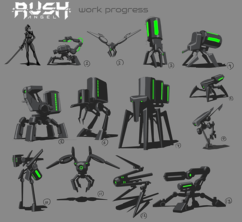


After analysing these two artists and looking at the brief I've decided that when I make my designs I will consider some things. One of those points is that I need to animate one of my robot designs, meaning I will have to keep my design somewhat simple, however to avoid my designs being too plain I will take inspiration from Andrei Mischenko and Ilya Pantyuhov. Some features I might take is the balance of the designs, for example if I manage to make my designs more humanoid I will mostly use plain metal plating, however inscribing the metal in certain places with holes and markings like Andrei's V1 concept with the 3 holes in the thigh and indents on the front chest. If I want to go even further I would add features like extra joints tubes and parts in areas that make sense like the folding parts and rotating limbs where most movement is needed, like Ilya's Rush Angel droid concepts, these details might be a good substitute for having a more complicated or humanised design. I think it would be better to do a more abstract and non human-like design anyways, as I find the more interesting designs to be less human and more like a metallic robotic creature. To help with my designs individuality, I would also like to add a simple paint damaged texture to my concepts as well as small light sources if I can on most of the designs.
Further Research
To ensure I had enough research, I researched one game mentioned in the brief and the concept art they had. I also researched different types of animation to see what different animation techniques I could use, but also see how different robots could be animated. Hence, I was completely certain I wanted to go with a semi-realistic robot concept or design. I tried to look at the game mentioned in the brief that aligned the most to the artist's work that I analysed, this is so I could easily adapt all my knowledge consistently while also comparing my work to a game my boss suggested, so the designs would fit the brief..
Portal 2
I decided to look at Portal 2 (since I can't find any concepts from the first) as from what I've seen it's concept art in design and style is the most similar to the two artists I've researched. The designs are very reminiscent to Ilya's designs specifically as of the red light sources and the slight use of cell shading. Some differences I've noticed is that the shading is much more smooth and clean with no noticeable brush strokes, as well as the designs having a lot more wire and light fixture components giving the robot's a more wild or aged look. I've also noticed the designs having more than one highlight colour or rather more than one light source, with the main red lights on the actual design with a white light pointed onto the design above the character, the design iterations for Atlas P-Body having another light source shown by the harsh yellow light hitting from the left. I think this reflects what Andrei Mischenko does with their iterations, however I think the way they apply it is more effective; I think I would use a combination of these two similar techniques as as of now the game's concepts are not decided so giving my iterations multiple environmental effects will help as a rough experiment if at least one of my designs align with the environment chosen.
Looking more closely at the designs themselves, they seem to follow the same HAL 9000 inspired look as many other robots have from different franchises, however I think the way Portal's designs stand out from the rest is because of how in the games they changed the red centre eye to blue or orange the colours often associated with Portal, as well as adding the uniform white that unites all of the designs. An aspect that also signifies the Portal aesthetic is the loose wires and black mechanical appendages that connect each white component, with most of the designs also having the recognisable Portal gun somewhere on their designs.
I think the feature that I would raw inspiration from would be the theme of having one reoccurring feature within my designs, whether that would be a colour palette or a mechanical component of some kind. It would help with the consistency of my robots when doing my iterations.


Different Animation Inspiration
Smoother Animation / Higher FPS
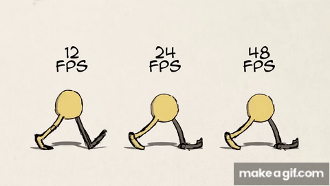
Higher frames per second, for example 24 + FPS, make for smoother animation and movements. For the past few years this smooth and fluid expression of animation has been the standard for most games and movies, with most media keeping frames at 24 frames per second, especially with the rise of 3D animated rigs being easier to animate with higher frame rates than 2D animation. This style of animation uses a lot of principles such as Easing, Secondary action and Solid Drawing. This style of animation is seen as more realistic as well as keeping scenes more intricate having more movement in each scene, however even as higher frame rate creates more realism and fluidity, it also has draw backs. First of all, it is more time consuming especially with 2D animation, also the use of higher FPS is to normally make a smooth, fluid and realistic animation which causes animations to loose principles like motion blur, squash and stretch and pose to pose.
Choppier Animation / Lower FPS
Lower frames per second, for example - 24 FPS, make for choppier and jerkier movements. Recently, this choppier style of animation has become an increasing trend due to Spiderverse and later seen in Puss In Boots: The Last Wish, this style is normally a combination of both 3D and 2D aspects aiming to replicate a stylised comic-like aesthetic in a 3D space. This style of animation uses a lot of principles such as Squash And Stretch, Exaggeration and Overlapping action. This style of animation is used in more action packed stories due to the snappy and expressive movement that can be conveyed in lower framerate, making scenes fast but also clear with Exaggeration. However, some drawbacks of low FPS animation is how it can look too choppy and janky if done incorrectly, as well as making smoother movements harder to achieve making this style more suited to cartoony and stylised animations rather than aiming for a realistic look.
Personally, I think I'm going to go for the lower frame rate animation style as no matter what my robot design will turn out to be, I would like the animation to be more expressive than realistic. I also feel that if I choose to make the animation more choppy then it will help better convey the slightly janky and unnatural movement older robots are portrayed as having. This will also help with the design of my robot, as I mentioned the choppier movement style being related to older and aged robot designs, meaning the starting point of my concepts will probably based off of old retro themes or reflect something ancient.
Development
First Designs/ Ideas


First of all, based on the shadow like sketches Ilya Pantyuhov did, I decided to make different silhouettes to try and build off of the most interesting and unique looking one. I thought that by drawing inspiration from Ilya's technique I could quickly come up with different ideas that I could draw into multiple iterations because of how loose the silhouettes were; being able to adapt the simple shapes of the silhouettes into anything. My first silhouettes were more human, as I was drawing inspiration from Portal's and Andrei Mischenko's more humanoid designs, specifically focusing on the wires commonly seen in Portal's concept art. Realising I wanted a more older design that was less futuristic, my silhouettes slowly evolved to resemble more of a raptor as I thought of the old and extinct theme that went along with prehistoric animals. I realised that I could turn the wires extending from the back into spine like spikes, and made the legs digitigrade, then I made the head a triangle to fit the angular theme of the body.
The dinosaur direction that I went in was inspire by Horizon ZD's animal robots, though with the next batch of silhouettes I put the dinosaur theme aside to make more human like silhouettes, as I liked the idea of a more humanoid robot after seeing that most artists and games I looked at had them. I tried to put more detail into these as I wanted a more fleshed out idea before I began to sketch out my design, the bottom two being the silhouettes I liked most with the one on the left having more personality and character by the way it is posed; seemingly laidback, and how it seems to be carrying a weapon. The one on the right is an adaptation of the robot dinosaur I thought of in the previous batch, I liked how I added a more bone like structure to its neck and added a more sleek appearance with its head and plated legs.
I chose to experiment with the structure of the robot dinosaurs silhouette, adding different shapes and balancing them differently across it's form. By comparing the silhouettes from my second group and my third group of silhouettes I found that the boxy and more animal like stance made the silhouettes in the third group look more friendly or at least less intimidating compared to the tall sharp figures of the second group. I wanted to keep the idea of the robot looking more dangerous while looking more humanoid, so I kept the overall shape of the dinosaur sketch from the second group and developed it to stand up right while fleshing out its spine and chest, I also thought of different iterations of the head encase I wanted to switch the head design for something else. Lastly, I drew the robot in a pose representing it hunting as I was planning to make the robot chase something in the story board.
With the last two iterations, I tried to reach for two sides of potential designs, one more leaning into the organic and dinosaur looking theme, with the other leaning towards a more robotic and humanoid design. I prefer the more solid and robotic design as the robot looked more bulky and intimidating, while the more dinosaur looking design looked more frail and friendly with the added eyes and the thin spine and limbs. Also, despite thinking the more animalistic design would look more retro and old, I think the more humanoid design looked more retro as all the bulky and exposed seams made me think that it looked like a combination of a old tank and a 1950s - 1980s toy robot design.


Final Design
I knew I didn't have much time conceptualising as I knew all my time would make up for modelling and animating the robot. Therefore to quickly create some coloured concepts I took inspiration from Andrei Mischenko's design process and rendered a drawing of my final design before copying and pasting it in a row so I could easily put colour on top.
Out of these variants I liked the simple black and red design as I felt the blue and red lined iteration and white highlighted iteration were too obvious or over the top, while the simple black basic original was too plain. This made the black and red one a good middle ground, however I do wish I made more iterations colour and design wise, as looking at the design I chose I wish I added a third colour somewhere or a light source, maybe in the opening where the head pieces are connected, to make the design stand out more as it is also quite dark.
Despite my critiques, I like the unique angular look to this robot, I also think because of how simplistic the colours are and how bulky and geometric it looks I think it does look at least older as i normally think of futuristic robots having smooth clean surfaces while also having brighter colours.
Story Board

Looking at the design, I decided I wanted him to be some sort hunter because of his sharp angular appearance and as he was based off a raptor. I first thought of making a walk cycle as it would be a safe start to the animation and I could build off of it, it would also be my backup if the rest of the storyboard was too complicated to animate.
The first panel is him walking, which is him patrolling an area in the forest. This would be looped for a few seconds before he turns in panel #2 where he hears something. Panel #3 would be him checking and waiting to see if he can see a trespasser of some sort before he chases them in panels #4 - 6, these panels would be in a different camera angle to the first few. Panel #7 switches back to the original camera, which follows a replay of the robot chasing after something into the forest, the camera then pans back to the original position to see the robot (who has now came back from the chase and is wiping off its arms in panel #8) returning to the original walk cycle.
Not much inspired the actions and events of my storyboard, rather it was my own ideas based off of my interpretation of his design and what would be most interesting, while also recognising what I would be able to animate. Even though I wanted to make the animation more simple I did try and test myself by creating different camera angle and also including a mix of slow and fast movements as I've never animated a fully rigged model before. I'm also planning to make the background 2D so I can experiment with 2D elements in a 3D space.
Modelling Process


I'm pretty familiar with modelling, however this was my first time modelling a full humanoid rig as I normally modelled off of a Roblox rig; the reason I started modelling was because I wanted to make custom accessories for Roblox characters.
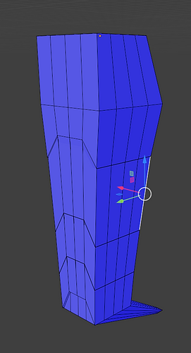
Despite my inexperience of modelling fully custom and rigged models I started as I usually would starting with the head and working my way down. The head was also the least complicated so I finished that first, then making the neck, upper chest and upper arms. I made sure to separate all these objects so when I rigged there was less bending and morphing in the model, as it was a robot and I wanted to at least convey that it was metal and not malleable or squishy with the exception with the rubber areas like the middle torso.
To save time, with the exception of the neck, I modelled only half of the robot so I could duplicate and mirror to make up the other half. I added the mirror modifier to the torso and exported and re-imported as a solid object as rigging it with the mirror modifier would only mirror the movement on the other side. I then copy and pasted the limbs mirroring them to make a full body model.
There wasn't really any complications when modelling the robot, as I had a lot of experience from modelling in the past. I made sure to try and keep tris as low as possible for less lag as a bonus while also making sure I had (mostly) good topology to make rigging easier.


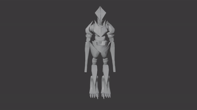
Here's the full model untextured, I also did a rough rigging plan to see how and which parts of then robots should move like the joints and rubber parts having small bones for the rig to either bend or move. I think I'm most happy with the model of the robot, and how I was able to convey the robot as sharp and angular in its model. However I do think I should have modelled the feet differently as the whole lower leg and foot is one object; this will cause bending when moved with the rig which is a problem because of the walk cycle I'm planning, having the legs and feet having the most animation.


Texturing Process
Texturing was the simplest part of the process, as I knew exactly what material he was going to be made out of; he was mainly going to be made out of a black shiny metal with the joints being rubber red. I used some Smart materials to make the base before adding some smart masks to add the slightly damaged edges of the robot and the wearing on its surface. I then used a rubber material and a brush to make the joints and moving parts, the leg arm joints and neck where all separate from the metallic material, however with the upper arm and the middle torso I had to manually fill out the sections and make sure none of the rubber bled onto the metal parts. Because of how tedious it was to manually fill out these sections I decided to leave the colour out of them since that would also require me doing the same thing, and by then I needed to attach the rig and complete the whole animation; I therefore sacrificed these parts of the design so I could have more time on the animation as that was the thing I knew needed more time and effort.


After finishing the base I added a tiny bit more detail by adding dirt and rust onto the legs to show that he runs a lot in mud and generally dirty areas. I also added a lighter slightly dusty masked material on top so the feet and legs where less shiny from being worn and worked. I also added some rusting on the end of their dagger claws to show that they've been used, now looking at them you could also interpret the splotches as dried blood from hunting. Overall, I wanted the textures to convey that he's been working for quite some time. With the retro theme, the colours are reminding me of late 1980s and 1990s robot designs. I think the only I would add would be a light source in-between it's head plates reminiscent of HAL 9000 as despite the trop being used a lot I think it would that extra detail that would make the design stand out.


Transferring the textures from substance painter to blender was the part I had the least experience on as I've never made textures outside of the built in program in Blender. After looking at different tutorials I managed to figure out how to get the textures onto the robot, it was much easier than I anticipated as it was basically connecting the dots that matched with the textures.
The textures were much more shiny than in substance painter however I think this creates a better affect as I'm planning my scene to take place at night. it might make up for the lack of light source I could have added onto the design so the robot can still be seen in a dark environment due to it reflecting the environmental light.
The only problem I had was how tedious the process was of matching each texture to the Principled BSDF. I also came across a problem when trying to connect the displacement (for the dirt and rust textures on the legs) to the Displacement Material Output. When I would connect the displacement map, smooth surfaces of the metal would appear janky and broken.
I tried fixing this by removing the displacement map all together, however I still wanted to incorporate the dirt texture on the feet I added it back. Even though this fault wasn't really noticeable I wanted to at least try and see if I could fix it, so I started trying to play around with the texture settings. In Colour space I found during my process I had to change the Colour Space type for different things; for example I had to use Non - colour for non colour textures. I found that Filmic Log was the best at hiding these faults, despite still being visible when looked at closely, though I don't think this would effect the animation too much.


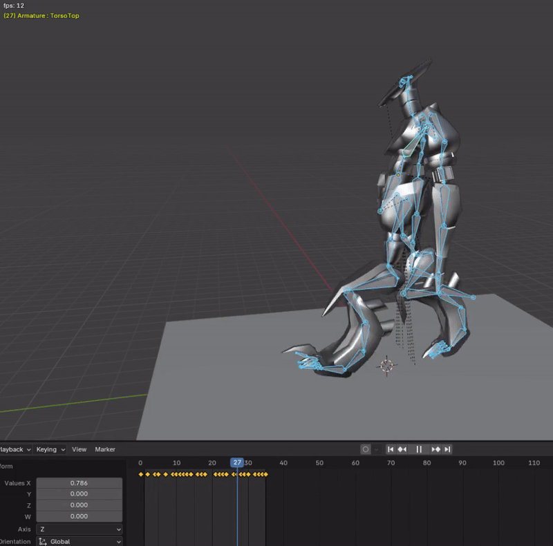
Rigging Process


I already had a rig from testing, however I didn't realise I exported that version into substance painter along with the model, causing the rig to extrude extra bones on the ends. I fixed this by deleting the unwanted bones before I continued with parenting the rig to the model. There are multiple ways to rig a model, however as this is robot I would like it to move more rigidly and I would therefore use two types of armature set ups; Deforming / Bending and Rigid / Separate. This is as my model is composed of both separated and joined parts, mostly separate as it allows for less bending and more rigid robotic movements. When parenting the armature to the rig I came across the problem of parts of the model bending where it shouldn't; this is as using automatic weights, parts of the model will conform or bend according to the wrong bones. So instead of using automatic weights I manually named each bone and body part, then in each body part in the Vertex groups I assigned the bones that each body part should be affected by. This mainly fixed the issue but I still had issues with vertexes in the same object being affected by multiple bones causing bending like in the torso; the metal hip bending with the rubber middle torso or the arm deforming. I found that I could manually change the Vertex Weights in one object, so I would select the vertexes that I wanted to assign a new weight to, set the weight of the bone I wanted the vertexes to be affected by to 1.000 and all the other bones to 0.000. This is so those specific vertexes will only be affected by that bone and that bone only. At the end I did some final touches of the rig like making the head bones less complicated and adding extra bones to the feet.


Animation Progress
After getting my model rigged, I started off my animation by putting in a plane to act as the floor, I then added the keyframes for the robots walk cycle. I didn't have much experience animating in blender, but I didn't have much time to research so I animated in the way I was comfortable with; moving each individual part. I knew there was a better method out there where I could move a body part like the feet and the whole leg would move accordingly, there is also a way for the model to collide with the floor (as I animated the model with the illusion of hitting the floor.) If I were to remake this animation I would definitely look into those to see if it would be quicker.
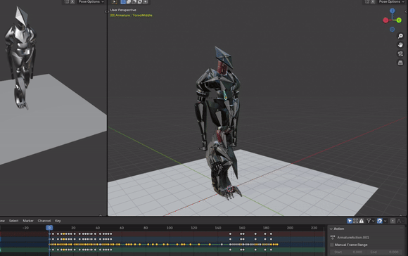
By then, the animation was at 24 frames per second, after completing the walk cycle I lowered the frames to 12 for a more choppy animation style. In my opinion the 12 fps made the animation look reminiscient of old 3D retro games, which complimented the geometric slightly low poly robot model. If I made the textures and rendering have a slightly lower quality I could definitely see this robot being a part of a late 1990s - 2000s video game or a game replicating that style.


With my animation I knew that I wanted a 2D background, so instead of the robot moving around in the environment I made the background move instead to create the illusion of movement. For most of the animation I made the robot remain completely in one spot, I then drew a picture of a dark forest with each layer of tree line and bush being a sperate layer. I imported these layers into Blender and animated them so they would move according to the robots speed and pace.
Unknowingly after finishing the animation I realised I had imported the images wrong, making them "Empty" instead of planes; this caused the images to not render when exporting the animations.
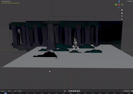
I fixed the image issue by replacing all the Empties with planes and copy and pasting the animations over to the planes while doing some changes. However fixing this issue made me realise how dark my background was compared to my robot and how I could barely see the background when rendering. I tried fixing this by adding light sources that lit up the background, while also making sure the lighting was realistic to a night scene. Despite the darkness being prominent, I think it made my robot stand out while hiding mistakes like being able to see the edges of the background images in some scenes, making them hidden unless you look very closely.


Final Animation

Evaluation
Research
Design
In the brief I was asked to make an animation showcasing the design of a Sci - Fi robot, inspired by Metal Gear, Portal, Horizon ZD, Primordia & Fallout. Before jumping into researching artists, I made sure to briefly look into the games suggested to me so I could get a sense of what was best to research and to get the overall aesthetic that was wanted; with most being slightly older games with detailed robot designs. With my research I chose to research an artist that was familiar to me who made pieces that I thought reflected the looks of the games suggested; I chose Andrei Mischenko as I was familiar with their work while they are known for helping the development of a indie game with overwhelmingly positive reviews called Ultrakill of Steam. This is where I first thought of making a more simple and geometric robot as the game Andrei Mischenko made concept art for replicated a retro 1990s video game look which consisted of lower poly models and textures. I wanted to tie this theme in with the more modern suggested games so after researching Andrei's works I began researching similar artists and came across Ilya Pantyuhov. Their art and designs were slightly more detailed, and it is their designs that inspired me to completely dedicate to the geometric theme of the robot. My research of the two artists helped me gather a lot of inspiration for what I wanted for my concept art and how to make concepts quickly because of how they made their iterations. To make sure I had a design that really fit the theme, my last piece of research was from analysing the concept art from one of the games suggested in the brief. Portal had concept art similar to the concepts my two artists made so I analysed how the developers made the concept art from Portal. This caused to solidify a reoccurring theme for my concept art; the retro / ancient theme which acted as a guide to make the designs more distinguished and more unique, however I also kept in mind that I didn't want to make a design that was too far off of what the brief wanted so taking inspiration from Portal, alike Atlas, P-body and GLaDOS being slightly humanoid I also went for this design trope reinforced by the humanoid designs my two artists made. If I had more time to research I would definitely look into the other games mentioned in the brief, but with the time I was given I think I made good choices with my research to gather enough info to help me with my development. I knew from the start of the project that I needed the most time for the animation, I therefore gave more time to the research so my designs were precise and quicker to make while still being true to what I and the brief wanted. Overall I'm happy with the amount of research I did within the time I gave myself and I feel like my research was relevant and helped me with my development process.
With my designs, I wanted this process to be the fastest part of the process so I could spend more time on the animation, I was going for a geometric and humanoid design that was a combination of the aesthetics of Portal and old retro games and themes. I used what I learned from my artist research and quickly made silhouettes for potential designs, I think this was a great choice as it sped up my process while creating interesting ideas than if I had just sketched out my ideas. My silhouettes were visually inspired by Portal and it's wires theme, however I remembered the retro and ancient theme I had set for myself, despite exposed wires slightly tuning into that theme I knew that I could come up with something more unique hence the dinosaur theme. I was quite happy with my Final Design as it was unique and was a balanced mix of all my previous points, and I had only created it in a short amount of time. As stated I would add a few things like a glowing light source somewhere, but with the context that it is a hunter and that it would probably need to be slightly camouflaged I feel like the lack of light source make up for the context of the character. Some other designs elements I like about the design is how simple the face is and how it contrasts to the rest of the body, however because of the more angular parts of the body like the thighs and the arms the head is still grounded in the entire design.
I made my storyboard based on how much time I had left, I estimated how much time it would take me to model the robot and make the animation and therefore made a story board allowing a safety net, so if I couldn't complete all of it I could fall back on the walk cycle I could easily make. I felt confident making my storyboard as I liked making comics in the past and I already established the robot being some sort of hunter, so it was easy for me to decide the more complicated part of the animation being him hunting. Later when I actually made the animation, I changed the camera angle to capture more of the robot to showcase the whole design more, but apart from that the storyboard was useful in a sense that it guided me to make a smoothly looped animation.
I'm happy with how it's modelling style is a mix of old style retro games and the more modern games like Portal and Metal Gear; you can visibly see the lower poly areas of the model while the textures are simple, metal and rubber textures with the occasional layered surface for dirt and mud. I also think that the model is not only visually appealing but the whole topology and wireframe is also consistent as I made sure to get rid of any triangles or polygons with over 4 vertices, this greatly helped the making of the model as it allowed me to easily texture it, however after I imported the model back the polygons did turn into tris, though this wasn't a problem as it didn't cause lag with Blender or made the model look different in any way. Despite wanting to improve my model, I think with the features I was able to give it in that time constraint the model is unique and harbours a good amount of detail even though I couldn't complete it's colours (I did go back when finishing the evaluation to improve the textures of the model down below closer to it's Final Design.) The last thing I would say about my model was after I finished it, if I were to remodel it I would use multiple objects the make the legs and feet so the metal wouldn't deform however seeing the final animation I think the current legs of the model are fine as it isn't obvious the metal legs are bending and separating the legs into multiple objects would only take up more time to model and rig.
Lastly, the animation was the most important part of the development to showcase the robot, I really like how it turned out as it showcases the robots docile and hostile nature; I think with the way I animated it I intended that it would have some human-like behaviours while also acting as a animalistic hunter while nodding to the dinosaur theme. I'm also proud about how I animated it's weight and how the robot collided with the ground despite not using any physic engines, I would in the future look into using Blender's physics to properly animate things interacting with each other next time. I think it's affective how dark the background is and how reflective the surface of the robot is as it makes the robot pop out from the environment without making the robot stand out too much, I especially like the lighting of its face as the flat planes make the eyes drawn to its face. The only thing I would change would be to make the background lighter as it might be slightly too dark on some displays, or find a way to make the a light source affect the background only to make it brighter. With the animation process itself I think it was affective doing keyframes, however, the process of moving and timing every single bones was quite tedious and I would look into more animation tips for Blender in the future. There was also the slip up with using Empties instead of planes, it was a relatively quick fix and didn't affect my time much but I would avoid the same mistake in the future. The parts of the process I liked the most was using 12 fps as it made both making and rendering the animation easier as using 24 fps would double the amount of frames of would be using which would also affect the time it took to render; it also made my animation look more stylised and more retro. The quick rendering also allowed more time to do final touches on the animation like the sound design as a bonus.
Conclusion
Looking at the brief and the theme I had set myself I can say my robot touches on SCI - FI and retro themes, it also takes inspiration from both my artists and I'm happy with how the animation turned out despite having less experience with rigging and animating with a full model. Even though this project had less concept art than the previous projects I definitely think the model and animation made up for it; I was also more enthusiastic about this project as I had never done 3D animation to a full extent. I would do a lot of things next time as a result of me learning to fix mistakes or problems I faced, like choosing between rigging methods and fixing vertices weights within the model. With my time I tried to roughly estimate how much time I needed to put into each part of the process, I decided that I had to put the most time into the animation I had the least amount of experience with it and animation normally is a tedious process, I therefore put 2/4ths of my project time into the research and concept art and 2/4ths of time into the animation. Seeing how the animation turned out in the end, I think I allowed myself enough time for the research, concept stage and animation process, even giving myself a tiny bit of time at the end to go back into substance painter and showcase the Final Model with the details I wanted to add above. Overall I'm happy with my final animation.

